
FOR YOUR FAMILY SESSION
Layers and styling
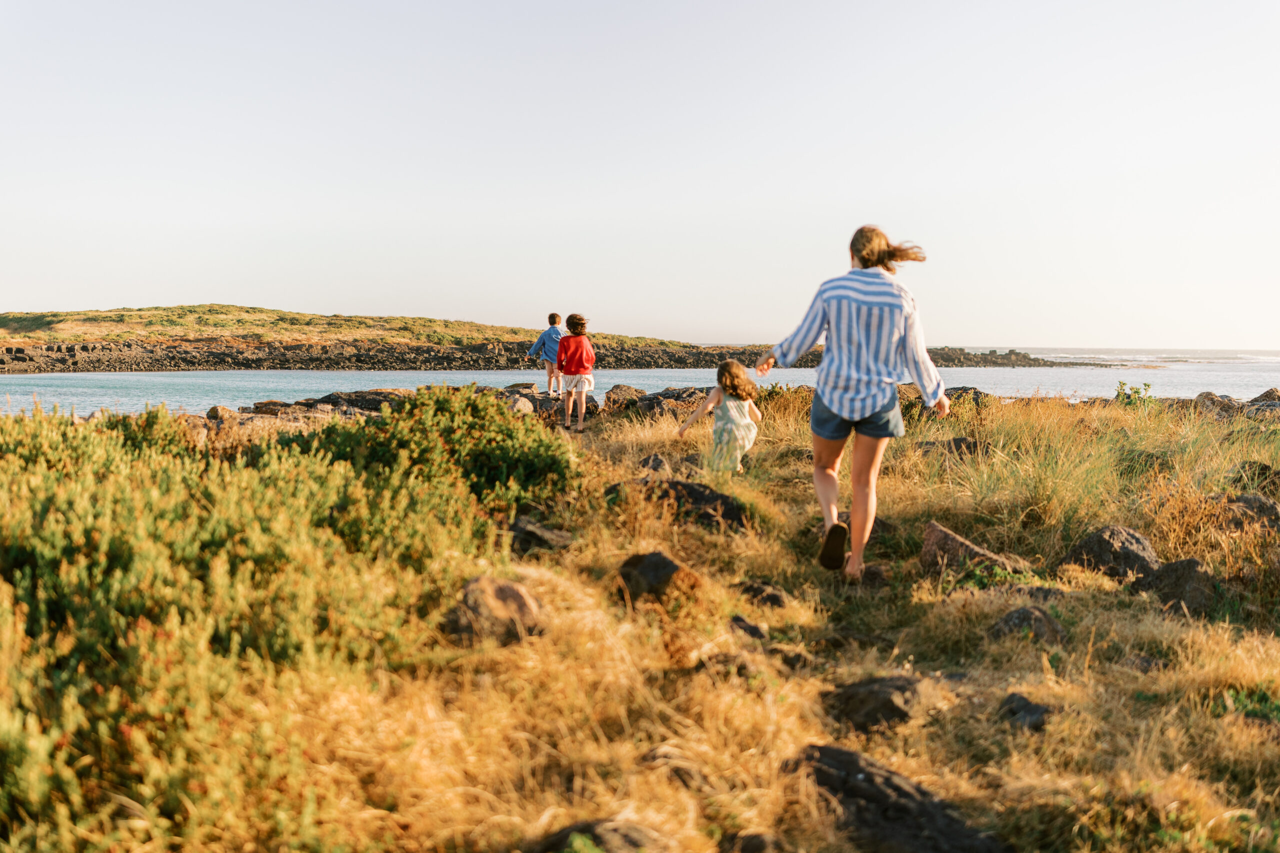
When planning your outfits for a session, we always want to steer away from anything too matchy-matchy and instead lean into contrast and variety. Outfits that are identical in colour can sometimes fall a little flat in photos, whereas thoughtfully mixing tones, textures and layers creates depth and visual interest. This doesn’t mean everything needs to be bold or busy—it simply means choosing colours that complement each other rather than replicate.
I know bold hues aren’t everyone’s natural go-to, and that’s completely okay. The same styling principles apply whether you’re drawn to rich, vibrant tones or softer, more muted palettes. It’s all about balance—pairing colours that sit well together, adding subtle variation, and incorporating different fabrics or layers to create a look that feels cohesive without being overly coordinated. Even within a neutral palette, you can achieve beautiful contrast by mixing warm and cool tones, or combining textures like linen, knits, and cottons.
One of my favourite places to find colour inspiration is Pinterest. It’s such a helpful visual tool when you’re trying to piece together outfits, especially if you’re unsure where to start. Simply searching “colour palettes” or “family photo outfit ideas” will bring up endless combinations you might not have thought of yourself. From earthy tones to coastal-inspired hues, there are so many creative ways to build a colour story that reflects your family while also photographing beautifully. Taking a little time to gather inspiration can make a big difference in how your final gallery looks and feels.